Website Structure
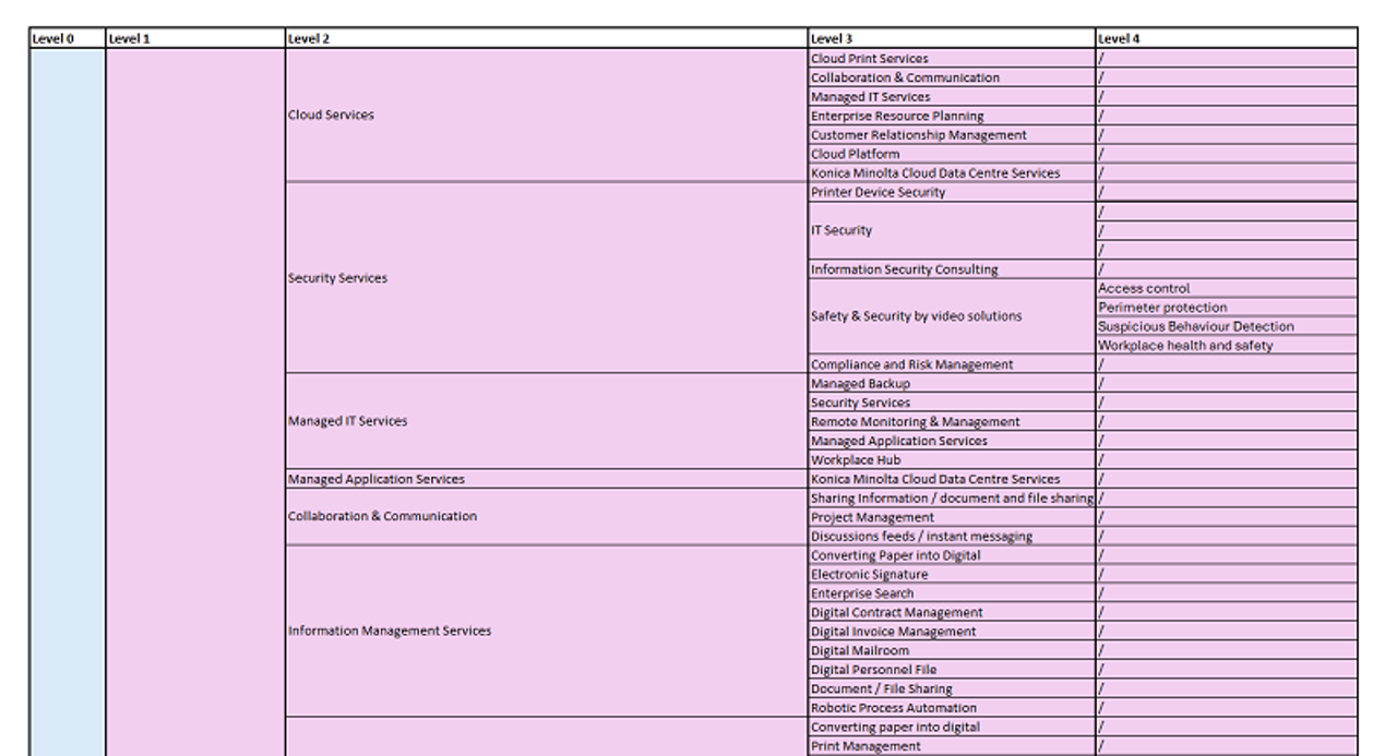
Please find below the website structure for the BEU website which we recommend to be the basis for your local websites.

(click image to enlarge) or Download Excel
We are aiming to achieve a unified Corporate Website navigation across all websites in Europe as all other brands are doing as well. Please make sure to follow especially Level 1 if possible.
For your reference I am quoting my email from September:
After carefully reviewing feedback from our local markets on the top navigation of our new Contentstack-based website, we have recognized the need for flexibility to better respond to the unique needs of each region.
Revised Decision on Website Navigation
Therefore, we decided to provide full local flexibility in the top navigation to you. This decision reflects our commitment to enable each market to optimize user experience (UX), maintain SEO performance, and align the website structure with their specific business and market goals. We understand that market-specific terminology and content strategies play a critical role in the success of each country’s digital presence, and we want to ensure that local teams could implement what works best for their users.
Key Guidelines for Local Teams Moving Forward
To ensure we strike the right balance between local flexibility and maintaining a cohesive digital identity, we would like to outline the following expectations:
- Keep the number of main navigation entries as low as possible for a simple UX - avoid line breaks for smaller screen sizes!
- The number of highlighted CTAs in the navigation should not be more than three to keep focus on what is really important.
- Build your website structure based on the globally aligned framework of “Intelligent Connected Workplace” and “Igniting Print Possibilities”
- BEU will run regular “success implementation audits” for our new websites, which will have a special focus on performance of the main navigation/user journey.
- Be prepared to share local best-practices when achieving better results with optimizations to the navigation of the website
We believe this new approach strikes a balance between maintaining a unified European presence while allowing each market the flexibility to optimize for local success.
How to start?!
We recommend to use the Excel template presented in the trainings:
How to get the urls?
We see the following options to get the url of the pages to optimize:
- Collect the urls from the current menu of the live site
- Collect from Kentico backend
- Walk through all Contentstack entries
- Kentico HTML sitemap
- According to defined structure
Entry titles
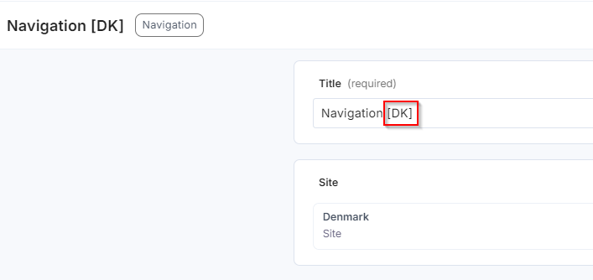
Please add your NOC/region code in brackets after the entry title if you create new entries.
E.g. a navigation entry for DK shall look like this:

Structured data
- Copy Organization Structured Data JSON
- Fill it with NOC-specific details
- Organization Structured data can be added in the “Site” content type in the “Structured data” field
Structured data is also planned for additional page types such as Events, Products, News and Blogs - Further updates will follow
Organization Structured Data JSON
{
"@context": "https://schema.org",
"@type": "Organization",
"name": "Konica Minolta Business Solutions Europe GmbH",
"url": "https://www.konicaminolta.eu/",
"logo": "https://www.konicaminolta.eu/images/identity01g.svg",
"vatID": "DE135099727",
"legalName": "Konica Minolta Business Solutions Europe GmbH",
"foundingDate": "1965-02-17",
"leiCode": "529900PBZSANCC87XM41",
"contactPoint": {
"@type": "ContactPoint",
"telephone": "+49 511 7404-0",
"contactType": "Customer Service",
"areaServed": "Europe",
"availableLanguage": "English"
},
"sameAs": [
"https://www.linkedin.com/company/konica-minolta-business-solutions-europe-gmbh/",
"https://twitter.com/konicaminoltaeu",
"https://www.youtube.com/@KonicaMinoltaEurope"
],
"address": {
"@type": "PostalAddress",
"streetAddress": "Europaallee 17",
"addressLocality": "Langenhagen",
"addressRegion": "Hanover",
"postalCode": "30855",
"addressCountry": "Germany"
},
"department": [
{
"@type": "Organization",
"name": "Professional Printing",
"url": "https://www.konicaminolta.eu/eu-en/professional-printing"
},
{
"@type": "Organization",
"name": "Digital Workplace",
"url": "https://www.konicaminolta.eu/eu-en/digital-workplace"
},
{
"@type": "Organization",
"name": "Healthcare",
"url": "https://www.konicaminolta.eu/eu-en/healthcare"
},
{
"@type": "Organization",
"name": "Measuring Instruments",
"url": "https://www.konicaminolta.eu/eu-en/measuring-instruments"
},
{
"@type": "Organization",
"name": "Textile Printers",
"url": "https://www.konicaminolta.eu/eu-en/textile-printers"
}
]
}